


In order to compare health costs in different countries, expenditures must be converted into a common currency. In practice, this is a more difficult problem than many people think.

In order to compare health costs in different countries, expenditures must be converted into a common currency. In practice, this is a more difficult problem than many people think.
More Read


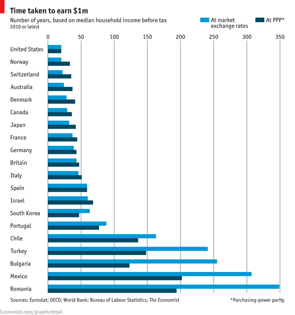
Here’s a graph from The Economist showing how the choice of exchange rate comparison can alter conclusions. The light blue line compares incomes in various countries using market exchange rates. The dark blue line compares incomes using purchasing power parity.
Market exchange rates are the price of one currency in terms of another when currencies are bought and sold on international markets. The demand and supply of international currencies is driven by the markets for internationally traded goods and by capital flows between countries.
But many of the goods and services that people consume never cross an international boundary. Purchasing power parity begins with the notion that in the long run exchange rates should adjust to equalize the price of the same basket of goods and services whether it is sold in Rome, Nairobi, or Tokyo. Define the basket of goods, price it in different countries, calculate the exchange rate that equalizes the prices, and use that exchange rate to compare costs across countries.
One of the more famous purchasing power parity indices is The Economist magazine’s Big Mac Index. The Big Mac is the only content of this goods and services basket (in India, where Big Macs are not sold, the chicken Maharaja Mac is substituted). In this 2012 post, the average Big Mac price in America was $4.20. The average Big Mac price in Switzerland was $6.81. Calculating Swiss franc/U.S. dollar rate that would equalize Big Mac prices leads to the conclusion that the franc to U.S. dollar market exchange rate is 62% higher than it should be. An up to date interactive Big Mac Index is here.
Most international health system cost comparisons use purchasing power parity. But the baskets of goods and services that they are based on vary. The Manhattan Institute has a chart from Chris Conover that compares the results for U.S. health care spending with the rest of the OECD using the GDP purchasing power parity used by the OECD with a different basket of goods that he terms health purchasing power parity.


