


Infographics and visualizations are hugely popular in all cultures, and there is unlimited opportunity to use them in a complex field like health care.
Infographics and visualizations are hugely popular in all cultures, and there is unlimited opportunity to use them in a complex field like health care. However, 15 seconds is all the time an online article has to capture a reader according to data from Tony Haile of Chartbeat. The data also suggests that people don’t readcontent on the web the way we think they do, as much as visualize it. Health visualizations then, like media, only have mere seconds to get a patient engaged. With such great opportunity for improving health literacy, patient activation and outcomes, better health visualization must be easily digestible, and must engage the reader’s emotions instantly. What BuzzFeed does in the media space, we might find useful for health, too. According to Devin Gross, CEO of Emmi Solutions, “Images, voice and text are all important parts of creating rich, emotional content that is relevant to individuals experiences. The goal is to bring real interconnectivity to the health space.”
A Picture Is Worth A Thousand Words
Pictures can give a patient a complete concept in seconds, where words alone often fall short. Tell a patient, “Don’t eat that next piece of cake, because excessive consumption of cholesterol increases the risk of heart disease and stroke”, and they will either ignore you or hear “Don’t eat cake, it kills you”. That’s neither true, nor encouraging. Visual cues can explain the opportunity for improvement in a more informative, fun and intriguing way.
More Read


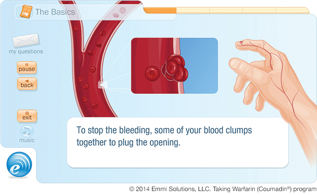
Emmi Solutions Instructional, Interactive Guide For Taking Warfarin
However, to use visualizations successfully – to engage and grab the attention of both the well and the ill – requires really understanding people. But if done appropriately, real improvements to public health might be possible. As David Spiegelhalter, Professor at Cambridge University in public understanding of risk says, “Often, numbers do not speak for themselves. They are part of narrative, and so there are no correct or objective ways of communicating them as text.”
At London’s recent WIRED Health conference, speakers made heavy use of data visualization to communicate the benefits of using certain technologies in health care and wellbeing. Although that was to an audience of medical professionals, entrepreneurs and media, data and charts could have been replaced with a wholly different narrative and disseminate the same story if need be for a lay audience.
Data visualization is not for everyone though. A crucial mistake in health would be to identify patients as one cohort – especially when they are a group of people suffering the same affliction. Therefore, Infographics and interactive visuals are one piece of the overall patient engagement goal.
Psychology Of A Patient
In a recent Business Insider post, columnist Milo Yiannopoulos asked why data journalism doesn’t always work; at least, not for most people who aren’t “data nerds.” He contends that news providers have forgotten that ordinary people are moved by pleasure and displeasure rather than spreadsheets. This is why money, sex appeal and humor all play major roles in media.
Ironically, many in the health space also seem to forget that patients are also people, and raw stats just won’t cut it. Health communicators must innovate to tell compelling, visual stories beyond the numbers. Or, as Emmi Solutions CEO says, “The dynamic of any relationship and subsequent health-related action come from feeling like you’ve been getting advice from a trusted friend. Learning in a friendly and meaningful way is really an extension of a relationship built on trust.”
Any communication professional will tell you, all people are different. Personality gurus Myers-Briggs split us into 16 broad personality types, describing how people perceive the world and make decisions. Based on analyses such as Myers-Briggs, we know that some people prefer the written word while others will want credible datasets to work through. Older people tend to have the time to want to do their own research and younger people tend to have no problem trading time for simplicity. But as a whole, almost all humans have a desire to connect with and relate to other people.
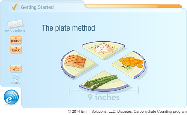
Emmi Solutions “Plate Method” Learning Tool
Many charities understand this well, such as Cancer Research UK, which collaborates with good PR agencies to tell trusted stories that tug at heartstrings. Yiannopoulos says that these stories get the most attention in the media because by the end, tears – whether from laughter or pain – are dripping onto the page.
Engage, Play, and Interact
The JBS3 risk calculator, developed by David Spiegelhalter and Mike Pearson at Cambridge University, is a tool to help visually communicate the risk of cardiovascular diseases and the benefits of interventions, whether lifestyle or pharmacological. It’s a good example of how to create engagement through instant feedback. Feedback is important because it contributes to the motivation and the emotional bond between data, good advice, understanding and future decision-making.
In a doctor’s office, the physician can use tools like this to tell a better story to their patients. Providers can more easily illustrate the potential of a different lifestyle choice, and the impact of behavioral changes. It further gives the patient choices, options and a vision of incremental benefit rather than black-and-white outcomes.
US-based Emmi Solutions is a company that provides multi-modal engagement tools that relay personalized, visually oriented health information throughout the entire care continuum, from prevention to surgery to self-care. Using teams of visual and graphic artists, voice artists, script writers and patient focus groups, the company creates content that, in theory, simplifies complex medical information to provide people with information that they can easily understand and respond to.
This idea also allows providers to have more meaningful conversations during notoriously short visits and better explain in-person what is happening, as well as send them home with reference material that they can interact with on their device of choice and when they’re ready to learn. Their results from over 12 years of being in operation prove that this approach does get people engaged and taking action.
On the academic front, the Robert Wood Johnson Foundation (RWJF) and the University of Michigan Center for Health Communications Research have joined forces for “Visualizing Health,” a project examining how data visualization for risk behavior can be applied. Their premise is that people need to be able to understand and respond to multiple types of health risk information.
According to the RWJF report, once people have information they can understand, they set goals, recognize that risk exists, judge whether the level of risk is acceptable or not, and use that to make a decision among options. As we grow, around the world, to better understand the learning preferences and human behavior that influences comprehension and decision-making, the ability of presentation could have significant impacts on public health. By creating educational materials that allow people to interact in ways that make sense to them, we empower them.
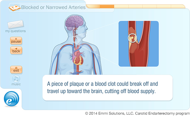
Emmi Solutions Interactive Carotid


