


How to Use Prior Period Analysis in Google Analytics


How to Use Prior Period Analysis in Google Analytics
More Read


Building web sites and actively managing online marketing campaigns for our healthcare clients is MD Connect’s core specialty. What makes our job fun, in a data nerd way, is looking beyond the flash of the front end and examining the data on the back end. We love looking at data! One of my favorite features in Google Analytics is called prior period analysis. Prior period data sets help tell the story behind the numbers. Prior period analysis is also one of the best features of Google analysis to answer the common question “is it working?”
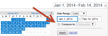
If you aren’t using the prior period feature in Google analytics, here’s a step by step guide and a few tips around how to look at the data and the story it is trying to tell you. Most are familiar with the date range box in Google Analytics, shown below. To use the prior period feature, simply check the “compare to” box below:

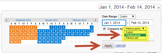
Once the ‘compare to’ box is checked, select the time frame you would like to look at in the pull down menu. You will have three choices in the pull down menu (highlighted yellow below): custom, previous period, and previous year. Once you have made your selection be sure to hit the “apply” button – in this case I’ve selected “previous period”. Once you do this a world of data will be unlocked!

I find previous period – say comparing past six weeks to previous period six week – to be the most helpful data set. This short term view can start answering basic questions such as – did the changes to the web site work? Here’s a great example:
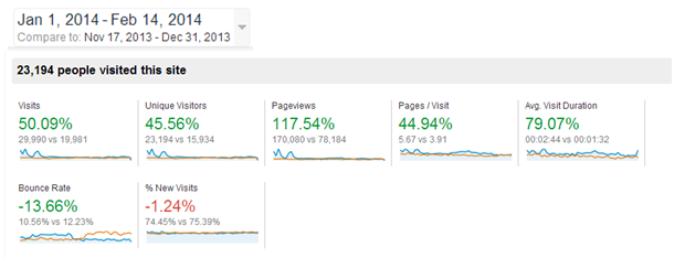

Above, we can see that the website changes in the last six weeks of the year (Nov 17th-Dec 31st), really paid off, and kick started a great run of results in the first six weeks of this year. For the above client, website optimization efforts included navigation streamlining, promoting entry ways to most read content and adding content. Simply said, we made it easier for the user to find what they wanted on the website and tried to make more useful content.
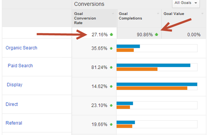
Too often, casual users of Google Analytics will only look at the traffic statistics and proclaim victory or defeat, based on visits. “Visits are up – great!” -or- “visits are down – bad!”. This is a mistake because this simple view does not measure the quality of the newly generated traffic. Quality can be determined by what the user is doing and the steps users are taking when they are on the site. In the our example the home run statistics are:
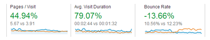

Increased pages per visit and average visit duration show the user is clearly consuming more content and is more engaged (a great thing)! Additionally, because fewer users “bounce” ((i.e. visits in which the person left your site from the entrance page without interacting with the page), the site has definitely improved. Don’t be fooled by rising traffic alone, because if traffic rise and the other quality indicative statistics don’t stay in your favor, an increase in traffic might mean wasted marketing dollars. In the case above however, it is a win-win-win. Traffic went up, quality engagement went up – and the third win is shown below, leads increased too!

I’m curious to hear in the comments below what other features in Google Analytics marketers use to help relay the story their data is telling. Understanding this story is key to continued marketing success.

