


I picked this topic for two reasons. First, I recently found out that CMS released their Part D Prescriber database for 2013. This dataset basically reports information on the drugs that individual physicians prescribed in 2013 under the Medicare Part D Program.
I picked this topic for two reasons. First, I recently found out that CMS released their Part D Prescriber database for 2013. This dataset basically reports information on the drugs that individual physicians prescribed in 2013 under the Medicare Part D Program. Second, while talking to my colleagues at work I realized how much they wanted to know to what extent their parents’ health is covered. Now, if you think about it: many of us have parents on Medicare with chronic illnesses. When their conditions are controlled and not aggressive (e.g. diabetes, high cholesterol, etc.) we are not that concerned about our parents’ healthcare coverage. In the end of the day, even if they didn’t have any insurance we would still pay for their Lipitor (cholesterol medication) or even insulin (commonly used to treat diabetes) and would diligently take them to their annual physical exam.
But how many of us thought what could have happened if our parent got an aggressive disease for which treatment is scarce and very expensive? Would we still pull out a wallet and pay $28k for their treatment? I don’t think so, but this is how much a 28 day supply of Hepatitis C (dominant disease among baby boomers) treatment costs.
Hope for the best and prepare for the worst, but what do you do if this happens to your older loved one? Many people rely on Medicare as a universal solution for this problem. We tend to think Medicare will cover any medical expense for treatment my parents need, so I don’t need to worry about saving my own money to help them. Is it true though? Does Medicare cover any kind of expense, and if so, to what extent?


Since I am not that familiar with how Medicare works (I’m enrolled in commercial insurance plan) and don’t really have anyone enrolled in Medicare (my family lives in Russia and there is no Medicare there), I decided to do some research to find out what the terms are for patients enrolled in Pard D Medicare plan.
According to the Medicare Pard D guide, there are 4 main types of costs a beneficiary may pay:
- Yearly deductible
- This is the amount you would pay out of pocket before Medicare starts sharing costs with you. In 2015 this amount cannot exceed $320-325 (and $360 in 2016). Some plans don’t have deductibles at all.
- Copayment/coinsurance
- Once you paid your deductible you start sharing your drug costs with Medicare. Your share is called copayment and it is typically 25% of whatever Medicare negotiated for your drug. Usually you keep paying 25% until your total out-of-pocket expenses reach $2,960 (in 2015) at which point the coverage gap kicks in.
- Costs in the coverage gap
- Once you’ve reached total of $2,960 out of pocket expenses, you are considered in a coverage gap, or a “donut hole” as they commonly refer to it. At this point you will pay 45-48% of the plan’s cost for covered brand-name prescription drugs or full cost for generic drugs. You will stay in the “donut hole” until you reach $4,700 in total out-of-pocket expenses.
- Catastrophic coverage
- Once you’ve spent $4,700 you become eligible for catastrophic coverage which basically means that you start paying 5% of your plan’s drug costs.
Now when we know the rules set for Medicare beneficiaries to pay for their drugs, lets look at what’s available in the data published by Medicare.
Data
2013 Prescriber Part D dataset provides physician level data on:
- NPI number of a provider (along with his/her name, specialty and practice location)
- Specific drugs prescribed by each NPI
- # of beneficiaries who received a prescription
- # drug claims prescribed by a physician
- Total day supply for drugs prescribed
- Total drug cost paid for claims prescribed
The data contains ~23.5M records and comes as a collection of text files which I imported into Tableau to perform descriptive analytics.
Since I am mostly interested in how much Medicare Part D beneficiaries pay in out-of-pocket expenses, I will start with calculating patients’ out-of-pocket costs first.
Our data is at the physician level, so everything we calculate will be per healthcare provider, not a patient (this is one of the limitations of my study). This assumes that at an individual physician/drug level all patients on average pay the same which of course is not true, but this is the closest I can get with available data granularity.
Based on the rules for out-of-pocket payment I will go through the following steps to calculate average out-of-pocket expense per physician:
- Obtain average drug cost per beneficiary (Avg Cost/Bene) by dividing Total Drug Cost by the Total Number of beneficiaries
-
Create a new field “Out-of-Pocket Cost” with the logical statement:
- If Avg Cost/Bene <= $325 then keep 100% of Avg Cost/Bene
-
If Avg Cost/Bene <= $10,540 then keep 25% of it for Out-of-Pocket cost. A few words about where I got $10,540 from. Remember, a Medicare Part D beneficiary has to pay 25% of whatever expenses exceed $325 deductible until s/he reaches $2,960. In order to estimate how much money s/he has to spend in order to spend $2,960 out of pocket, the following equation needs to be constructed
-
If Avg Cost/Bene <= $14,203 then keep 47.5% of it for Out-of-Pocket cost. This is the part of out-of-pocket expenses commonly referred to as a “donut hole”. Just like with previous calculation, you derive 14,203 from the following equation
-
If Avg Cost/Bene > $14,203 then only keep 5% of it for Out-of-Pocket cost. This is the part of patient’s expenses referred to as catastrophic coverage.
There are a few limitations associated with calculating out-of-pocket costs this way.
First, all calculations are at the physician level, so obviously some patients never enter donut hole or catastrophic coverage whereas others incur significant expenses very quickly.
Second, not all drugs have the same supply duration and even though the data represents only 1 year, some patients may enter catastrophic coverage right away by getting a prescription for 28 days that costs $70k+, but other patients will go from stage to stage getting cheaper drugs for a more extended supply period and, therefore, will move from deductible phase to copayment to donut hole.
Third, not all patients have deductible or have to pay the same out-of-pocket cost. For a lot of patients over 65 years old there are other state benefit plans that may cover the cost of the drug. We do not capture those additional plans here.
I also created another field that calculates average out-of-pocket cost per day to equalize second limitation I brought up earlier.
National Descriptives
My first goal was to understand how out-of-pocket costs are distributed across the country. Visualization below shows a heat map of average drug costs per beneficiary broken down by state and out-of-pocket costs/day broken down by city.
To interact with this visualization please visit my original blog post here
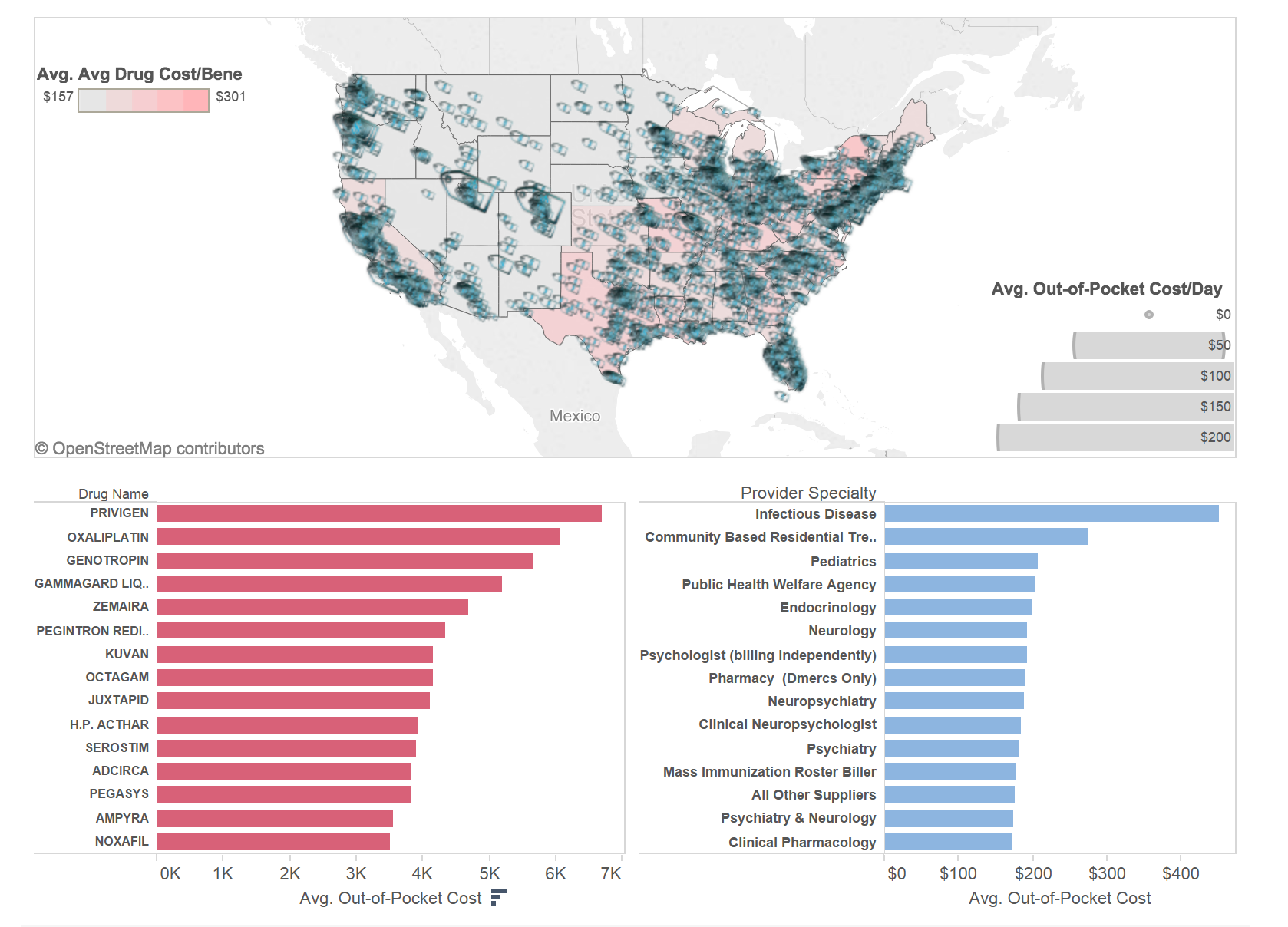

As we can see, average drug cost per person per state ranges between $157 – $301 per year and you can see a very clear separation between West (except for California) where average costs are stabilized at well under $200 and East and California where patients on average pay over $200.
I did some research around why there may be differences in average medication cost per patient between East Coast and West Coast and came across a paperpublished by CMS in 2009 that talked about regional variations in drug prices and spending in the Part D program. Some of the reasons they discuss are:
- Medication Choices. In some regions patients prefer brand name drugs over generic ones (this is often driven by region’s income level) which inevitably drives prices up. If enough people choose brand name medications on the regular basis, a higher average price becomes a norm in this region.
- Per capita drug utilization. Not all drugs are prescribed equally in all states. For example, for many oncology conditions and rare diseases patients have to travel to a foreign state to find specialists who have experience treating a specific type of a disease. Using this Cancer Center Heatmap you can actually see that most cancer centers are located in Northern and Southern East and far Western regions of the US (WA and CA). Since oncology medications are expensive, this migration of patients to cancer centers drives average cost per drug up in these regions.
Price tag icons on the heatmap represent average out-of-pocket cost per person per day by city of residence. Again, you can see a much larger concentration of spending on the East Coast and California than in the Midwest and Southwestern regions. One interesting observation that supports my point about utilization earlier is that if you look at the areas with lower average cost you may notice that price tag icons there are also much smaller. Smaller price tags mean that patients on average pay less money per their prescriptions on the daily basis, which basically implies that they buy cheaper medications than patients in regions with bigger price tags.
Now we’ve established that average costs of drugs are largely driven by the type of drug prescribed. Under the heatmap on the lower left side you will find a ranking of the top 15 drugs prescribed to Medicare beneficiaries. 4 out of these 15 drugs are used to strengthen human’s immune system and help fight infections. Another 3 are used to treat Hepatitis B & C, 1 treats colon cancer and the rest help control rare diseases like growth hormone disorders and multiple sclerosis. These drugs’ average out-of-pocket cost varies from $3.5k – $6.8k in 1 year.
I also looked at the physician specialties that prescribe the most expensive drugs. Top 2 specialties were infectious disease specialists (who treat Hep B & C that require costly drugs) and Community Based Residential Treatment Facilities (that typically treat mental diseases that also utilize expensive treatment options).
Diving Deeper
Now when we know that overall costs for Part D medications are not the same across the country and that they are largely affected by such factors as the nature of the drug (e.g. very expensive Juxtapid vs. cheap Lipitor), region (East and West Coasts have significantly more specialty treatment centers than Midwest) and treatment choice (brand name vs generic drugs), we need to understand what drives the out-of-pocket cost for a drug covered by Medicare. Not only am I interested in understanding how costs differ across drugs in similar categories but also within the same drug category. If 2 Part D beneficiaries were prescribed exact same medication, would they pay the same amount out of pocket all rest being equal (e.g. they were on the same coverage stage when they had a prescription)?
I selected a subset of the top 100 most expensive drugs in the data and plotted them against two dimensions – average out-of-pocket cost per day and average supply amount per beneficiary. Recall that the data was initially presented at the physician level and even though I calculated average cost per beneficiary and out-of-pocket cost derived from it, I was still running into an issue where for the same drug I could have had different out-of-pocket cost not because it costs differently for different patients but because they had different supply period (e.g. 30 days supply vs. 6 months) which obviously plays a big role in cost structure. In order to mitigate this I divided out-of-pocket cost by supply period and obtained amount of money each beneficiary on average had to pay every day.
To interact with this visualization please visit my original blog post here
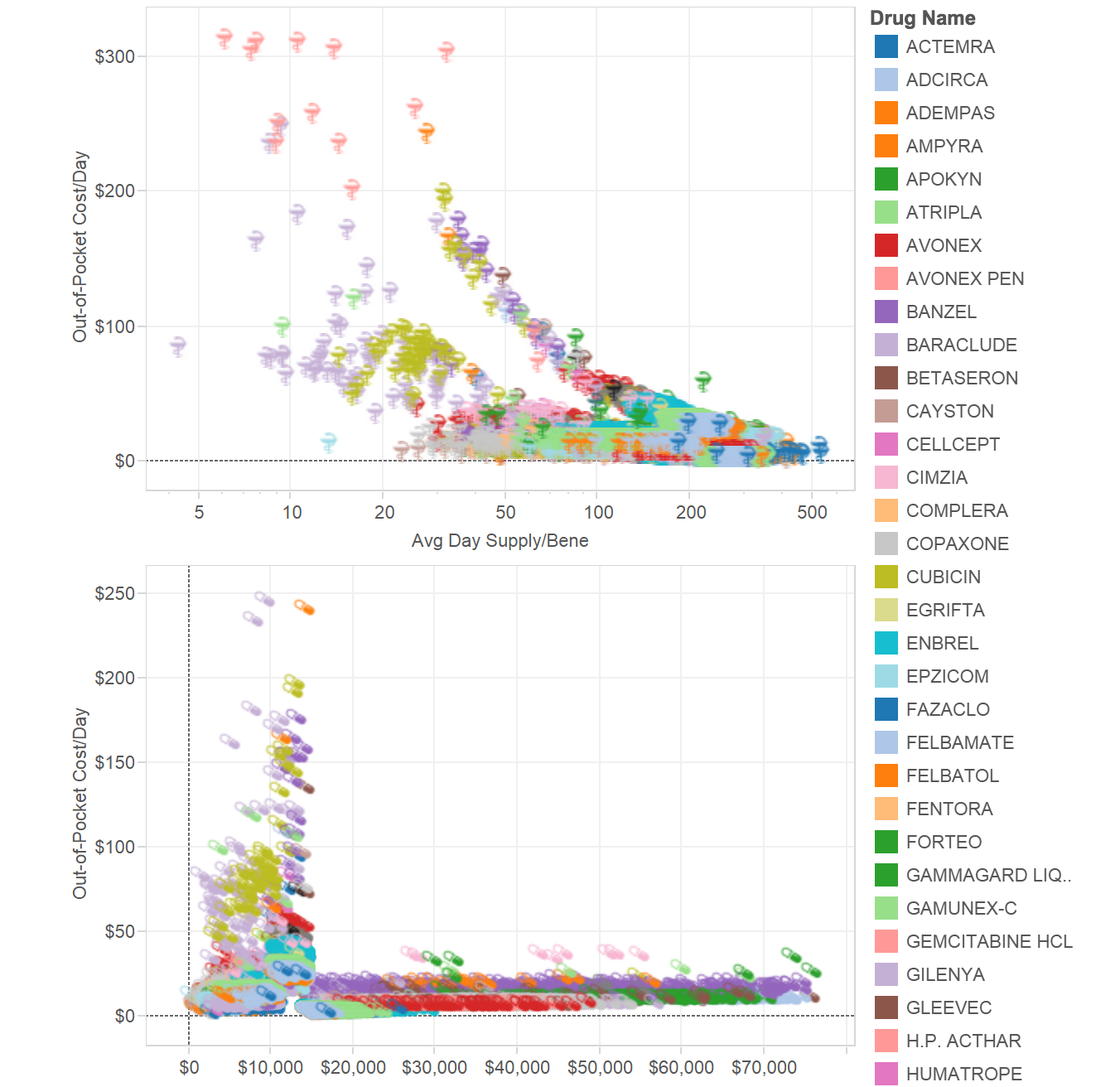

As you can see from the top visualization, the longer supply period is the lower patient’s out-of-pocket cost is for a drug. Even in cases of the same medication. For example, Neupogen prescription (drug used to reduce infection risk in patients undergoing chemotherapy) may cost a patient $35/day if prescribed for a period of 20 days and will cost $163/day if prescribed for only 7 days. You may also notice that generally there are 2 groups of drugs that lower out-of-pocket costs with supply increase at different speed. Drugs along the top curve consistently cost patients more than drugs along the bottom curve until both reach supply of ~150 days at which point both curves merge.
On the bottom of the chart you may see the relationship between out-of-pocket cost and average drug cost per beneficiary. Here I wanted to estimate how much on average a drug should cost in order to bring a patient to the next coverage stage in his/her coverage cycle. Obviously, the more a drug costs the faster it will force a patient to go from deductible to co-pay to donut hole to catastrophic coverage stage. But an influx of out-of-pocket costs on the left side of the chart suggests that there is a category of medications prescribed for a short period of time (under 45 days) with total cost of $8k – $14k that end up being most expensive for consumers. Part D beneficiaries may pay anywhere between $70 – $250 per day with very little/no Medicare support because at this point they are at the “donut hole” stage when catastrophic coverage has not yet kicked in.
A Few Thoughts
Hopefully this quick look at the cost structure in Medicare Part D has answered some of the questions you had about this data or maybe it triggered even more questions – either one will make me happy 🙂
There is plenty of questions to be answered by this data which is why I was so excited when I came across news that announced release of the data a few months ago.
As I saw in my analysis, even the same drugs may cost differently depending on where they are prescribed, by what physician and for how long. Generally speaking if one wants to pay less out of pocket s/he will try to extend a period of the prescription for at least 3 months if this is a long-term therapy. Most short-term therapies are the costliest to consumers.
One important thing to note here is that to make this observation I only took top 100 expensive drugs to create scatter plots with. I did this intentionally because I wanted to get a clear idea about potential reasons for out-of-pocket cost differences and costly drugs showed an exaggerated picture. So all my conclusions do not necessarily apply to the rest of the drugs out there, or at least not to the same extent.
Drugs in infectious disease and mental health areas end up costing Part D beneficiaries the most. Potential reasons for this is the cost of therapy in these specialties (Hep B & C, HIV, psychiatric disorders) and possibly prevalence of brand name drugs over generic ones.
There are regional differences in how much patients pay for their health but this may be largely driven by the location of treatment centers where costly drugs are being prescribed as opposed to by the pure price imbalance.
Finally, I was surprised to see that when I isolated the most expensive medications (based on out-of-pocket cost) I only saw a few cancer treatment options. The highest cost prevailed in drugs that support human immune system and treat rare diseases. In these areas target patient population is low but the cost of therapy is so high that even 1 patient who initiates therapy brings significant revenue to the brand. Patients, however, struggle to afford these expensive treatment options and often opt for no treatment at all. I wonder how this picture would have changed if “donut hole” was reduced for these drugs and Medicare paid catastrophic coverage for the full price of the drug?


