
Editor’s Note: Dan Munro is a contributing editor to Forbes.com. His columns are collected under the heading, “The HealthCare Compass.
There were a few charts that made the radar this year. In some cases, the data is older than 2012, but all too often, the data hasn’t really changed or improved with age.
Editor’s Note: Dan Munro is a contributing editor to Forbes.com. His columns are collected under the heading, “The HealthCare Compass.
There were a few charts that made the radar this year. In some cases, the data is older than 2012, but all too often, the data hasn’t really changed or improved with age.
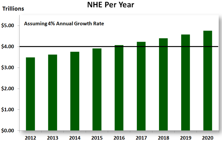
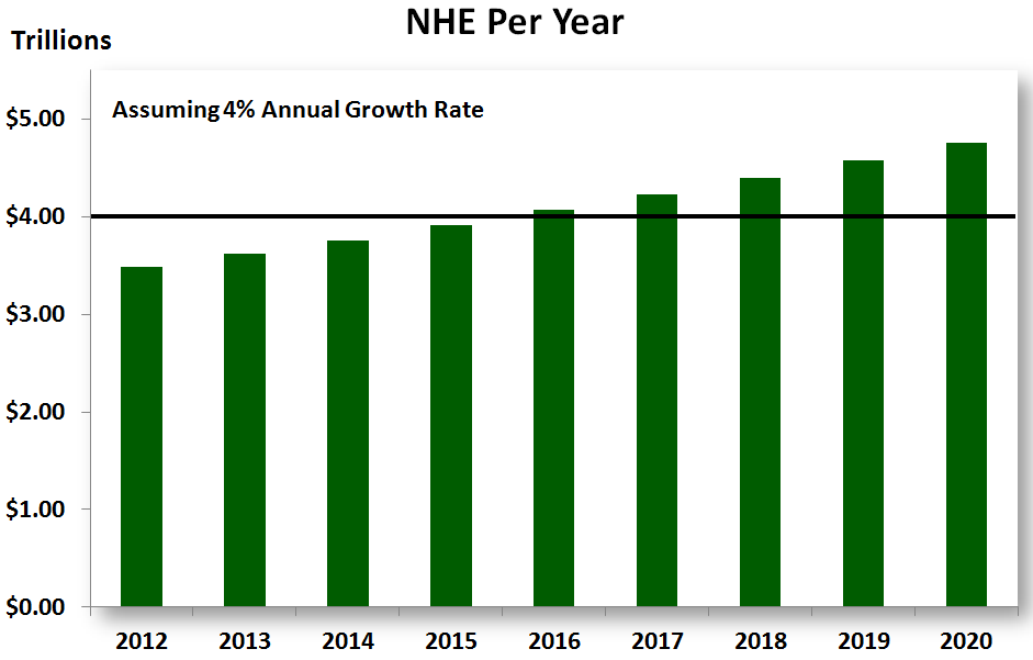
First up is our National Healthcare Expenditure (NHE). According to the Deloitte Center for Health Solutions, this number has been historically underreported – by a significant amount. In their report (The Hidden Costs of U.S. Health Care), they cite two important components that have not been included in tradtional calculations. The first is out-of-pocket spending by consumers on professional services and the second is the “imputed value of supervisory care provided to a friend or family member.” Using a conservative annual growth rate of 4% (from Deloitte’s baseline year of 2010), here’s what Deloitte suggests is our real NHE.
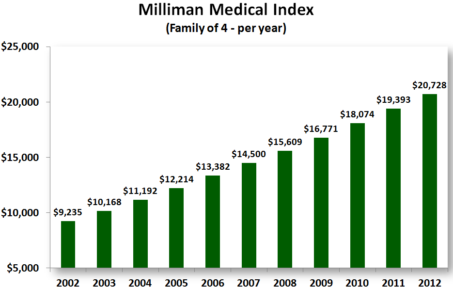
Next up is the 2012 Milliman Medical Index – which eclisped $20,000 for the first time this year. According to the index, every U.S. family of 4 is paying the dollar equivalent of a new Chevy Cruze in healthcare costs. Every year. Without financing.
The largest single component, of course, is the underlying cost of health insurance. The Kaiser Family Foundation (KFF) released this chart to highlight just that growth. One clear takeaway (when compared to the Milliman Index above) is the corresponding increase in out-of-pocket healthcare expenses.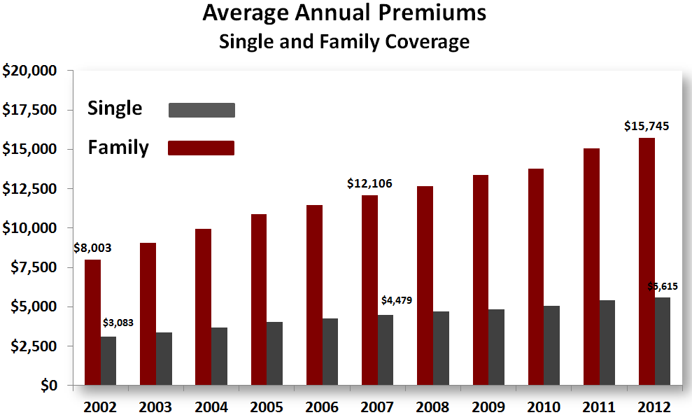
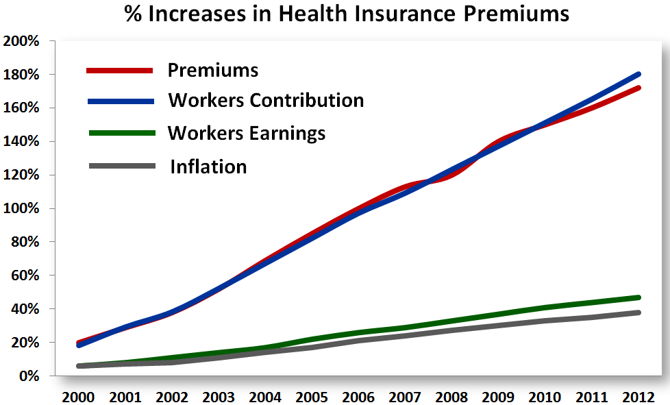
The Kaiser Family Foundation also provided a comparison of cumulative increases in health insurance premiums – relative to Workers’ Contributions, Inflation and Workers’ Earnings (from 2000 to 2012).
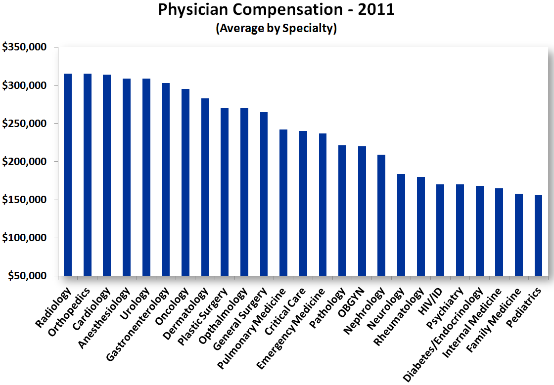
Another annual chart is Medscape’s Physician Compensation Report: 2012 Results (slide #2 – 2011 data). I wasn’t that surprised by those on the lower end, but it was surprising (at least to me) to see Radiology as the highest (average) compensation.
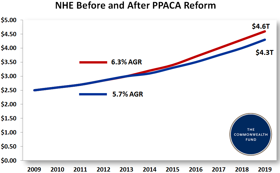
For those that may be relying exclusively on the transformative effects of PPACA (Obamacare) – this chart highlights the nominal impact of PPACA reform on our National Healthcare Expenditure. It’s from a Commonwealth Fund Issue Brief (May, 2010) – The Impact of Health Reform on Health System Spending (Exhibit #3 – page 5).
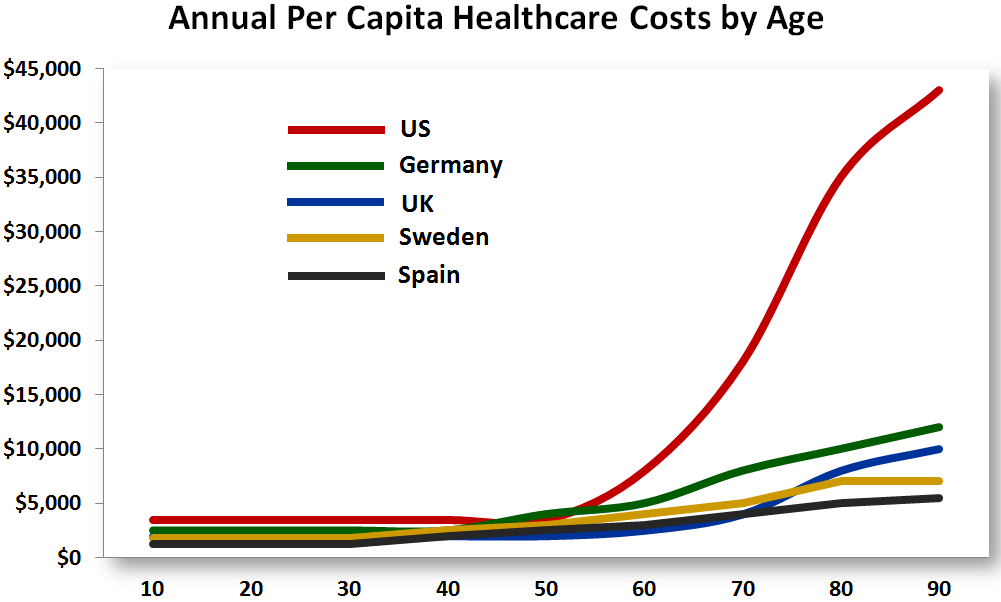
This next one was orignally assembled by Carnegie Mellon University professor Paul Fischbeck – and reported by Mark Roth of the Pittsburgh Post-Gazette (December, 2009) – and highlights our Per Capita Healthcare Costs by Age as compared to four other countries (Germany, the U.K., Sweden and Spain).
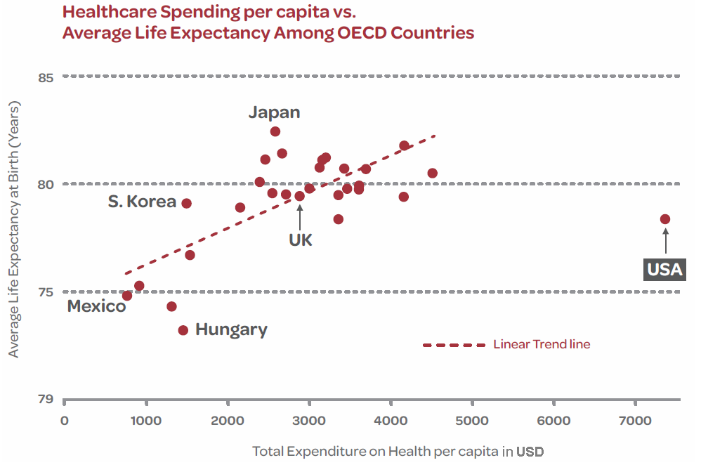
This last one from Mary Meeker’s landmark report – USA, Inc. (slide #111) – is definitely not new but it is foundational. It compares per capita costs and life expectancy across all 34 OECD member countries using OECD data from 2009.