One website element that’s often overlooked is the call-to-action button. If you really want to encourage your prospects to convert, these buttons need to be optimized.
Making sure they look pretty isn’t enough. You could have the nicest-looking buttons on earth, but it’s all for naught if nobody clicks on them.
Here are some tips to help you create compelling CTAs and get more clicks:
Don’t Neglect Copy
More Read

One website element that’s often overlooked is the call-to-action button. If you really want to encourage your prospects to convert, these buttons need to be optimized.
Making sure they look pretty isn’t enough. You could have the nicest-looking buttons on earth, but it’s all for naught if nobody clicks on them.
Here are some tips to help you create compelling CTAs and get more clicks:
Don’t Neglect Copy
The words you put in your call-to-action button can make or break a conversion. Words like “Learn” or “Request” are great words to include on a healthcare-related website. Also, stay away from words such as “Submit”; many users will be skeptical of giving information too quickly.
Keep It Simple
Simplicity is key. Always use bold, contrasting colors but don’t make wild, crazy graphics. Simple buttons that look and appear clickable are what people want and understand. You can achieve this by using bevel-type shapes and shadows.
Be Direct
Most people visit a healthcare-related site for research purposes. Whether they’re looking for information on an illness or a physician, they want answers quickly.
To avoid a high bounce rate, you need to ensure that visitors have a direct path to the information they seek; don’t be vague. For example: Instead of just having a CTA button with the word “Download,” have it read “Download Doctor Smith’s CV”. Rather than using the word “Submit” at the end of your contact form, use the words “Click to Make an Appointment.”
Again, stock action words like “Register” can lower your conversion rate exponentially. Try using short self-referencing words that suggest action and momentum.
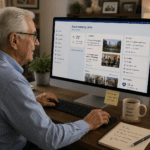
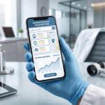
Be Mobile-Friendly
With many users now viewing websites via mobile devices, it is essential that your CTAs be adaptive. It’s also important to have them placed above the fold and within the visitor’s “eye path” for maximum visibility.
A CTA button can be the difference between obtaining a new patient or not. For additional CTA tips and tricks for your healthcare website, contact Wax Custom Communications at 305-350-5700 or visit waxcom.com.
The post Create Compelling Call-to-Actions for More Clicks appeared first on Wax Communications.