We use cookies, including third-party cookies from Google to serve personalized ads through AdSense, to operate this site and understand how it is used. By continuing to browse, you accept this use. See our Privacy Policy and Terms of Use for details, including how to opt out of personalized advertising.
Accept
Health Works CollectiveHealth Works CollectiveHealth Works Collective
  • Health
    • Mental Health
  • Policy and Law
    • Global Healthcare
    • Medical Ethics
  • Medical Innovations
  • News
  • Wellness
  • Tech
Search
© 2023 HealthWorks Collective. All Rights Reserved.
Reading: Great Healthcare Infographics: 2 Things Your Data Visualization Needs
Share
Notification Show More
Font ResizerAa
Health Works CollectiveHealth Works Collective
Font ResizerAa
Search
Follow US
  • About
  • Contact
  • Privacy
© 2023 HealthWorks Collective. All Rights Reserved.
Health Works Collective > eHealth > Social Media > Great Healthcare Infographics: 2 Things Your Data Visualization Needs
Social Media

Great Healthcare Infographics: 2 Things Your Data Visualization Needs

Nicola Ziady
Nicola Ziady
Share
1 Min Read
diabetes infogaphic
SHARE

Data is easier to understand when it’s presented visually. But sometimes graphic designers get wrapped up in making content beautiful and forget to make it functional.

Here are two things to keep in mind when creating an infographic:

Data is easier to understand when it’s presented visually. But sometimes graphic designers get wrapped up in making content beautiful and forget to make it functional.

Here are two things to keep in mind when creating an infographic:

More Read

#whatifhc, #howmuchisthat? and 5 Other Virtual Healthcare Conversations to Join
Doctors 2.0 and You – Coming Up!
Health 2.0 Conference: Data Liquidity Can Improve Care and Reduce Cost
The Connected Elderly: Improving Their Health
Who is the Healthcare Consumer?
  • Know your audience. You can’t help your viewers make a decision unless you know what they’re looking for. Ask yourself: How will patients read and interpret the information? What do they know already and what do they want to find out?
  • Tell a story. The right graph and data range should convey a compelling narrative. Create a visual that helps the viewer observe, understand and make sense of the information.

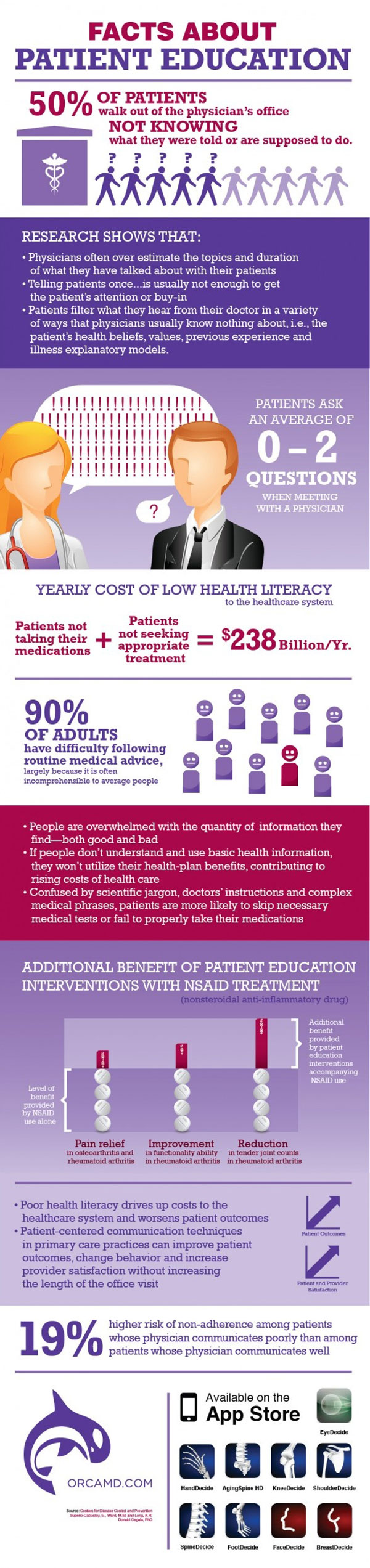
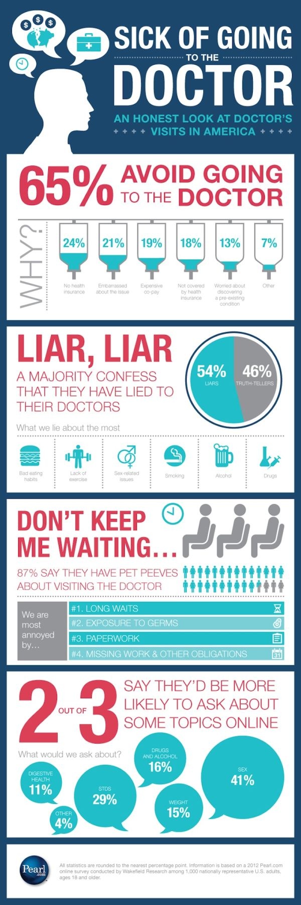
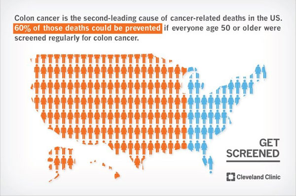
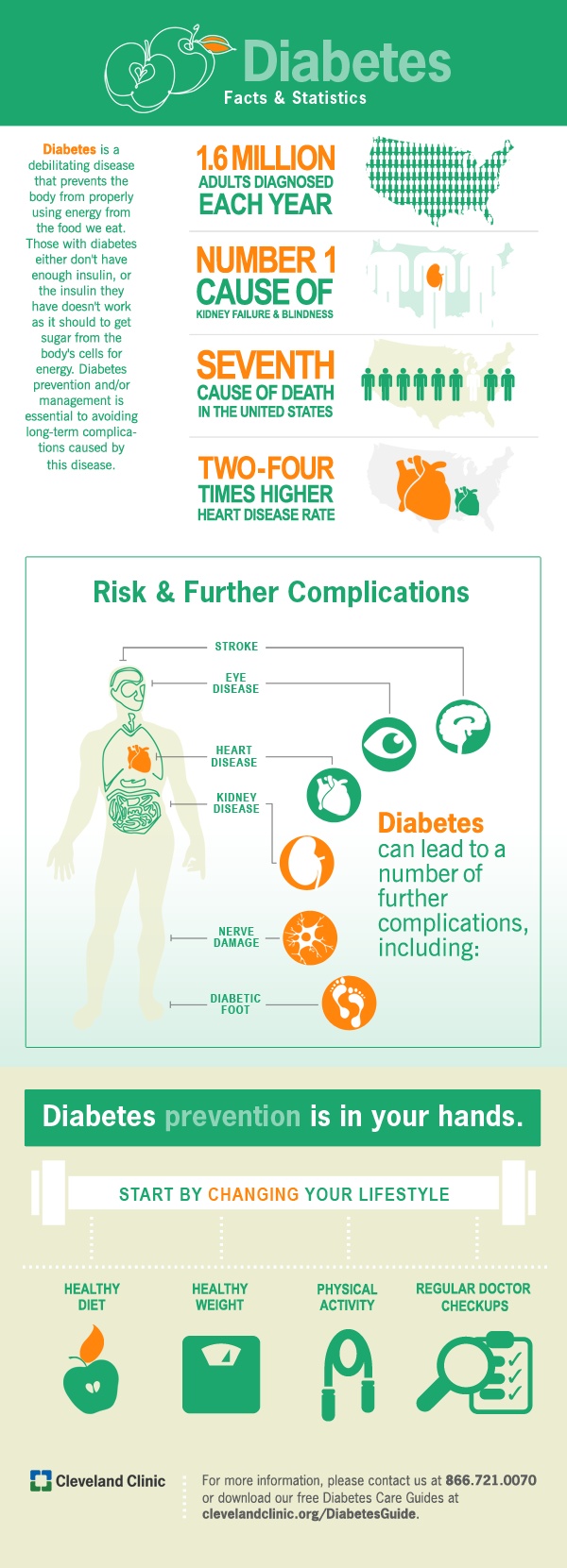
Great healthcare infographics:
diabetes infogaphic


patient-education

doctor infographic

colon-cancer-infographic

Post to Twitter

TAGGED:infographics
Share This Article
Facebook Copy Link Print
Share

Stay Connected

1.5KFollowersLike
4.5KFollowersFollow
2.8KFollowersPin
136KSubscribersSubscribe

Latest News

How to Choose an On-Demand Medical Interpreting Provider for Your Hospital -- AI-generated illustration
How to Choose an On-Demand Medical Interpreting Provider for Your Hospital
Health care
August 12, 2026
The Chemistry Of Drug Consistency -- AI-generated illustration
The Chemistry Of Drug Consistency
Policy & Law
August 12, 2026
Dental Materials Through The Decades -- AI-generated illustration
Dental Materials Through The Decades
Dental health Infographics Specialties
August 12, 2026
DNP or PhD: What Each Actually Means for Your Nursing Career -- AI-generated illustration
DNP or PhD: What Each Actually Means for Your Nursing Career
Career Nursing
August 12, 2026

You Might also Like

pharmaphorum LinkedIn tips
BusinesseHealthSocial Media

Some Top Tips for Budding LinkedIn Influencers

May 13, 2014

How many self-employed research associates does it take to change a light bulb?

October 15, 2015

Google+ Local: How It Impacts Your Medical Practice

June 1, 2012

Driving Your Healthcare Marketing Further in 2016

March 3, 2016
Subscribe
Subscribe to our newsletter to get our newest articles instantly!
Follow US
© 2008-2026 HealthWorks Collective. All Rights Reserved.
  • About
  • Contact
  • Privacy
Welcome Back!

Sign in to your account

Username or Email Address
Password

Lost your password?